Adding the widget to your dApp
Install the package @cedelabs/widgets-universal.
Usage
import { renderSendWidget } from "@cedelabs/widgets-universal";

const rootSelector = "#cede-widget";

renderSendWidget(rootSelector);
The widget will be rendered inside the element with the id cede-widget. You can use any other selector.
Adding default values to the form
To populate default values to the form, you can use the configuration property defined here.
const widgetConfig: SendWidgetConfig = {
  tokenSymbol: "USDT",
  network: "ethereum"
  address: "0x2791bca1f2de4661ed88a30c99a7a9449aa84174", // destination address
  amount: "123.37",
  lockNetwork: false,
  exchangeIds: ["binance", "coinbase", "bybit", "kraken"], // you can limit exchanges to those supporting your token/network if needed
};

renderSendWidget(rootSelector, { config: widgetConfig });
Info:
If you prefill only the network, both the tokenSymbol and the network will be empty. If you prefill both the tokenSymbol and the network, if the combination is available on the selected CEX, the inputs will be filled
Good practices:
To guide your users through a Send, we recommend you to pre-fill the form with his connected wallet address using the
property address.
Updating config values
Whenever the user changes the network, token, or his connected wallet address, you can update the widget by calling the
renderSendWidget function again with the new configuration. You don't need to clear the content of the root element.
renderSendWidget(rootSelector, { config: oldConfig });

// the user connects with a new wallet address

renderSendWidget(rootSelector, {
  config: {
    ...oldConfig,
    address: newAddress,
  },
});
Customize the widget
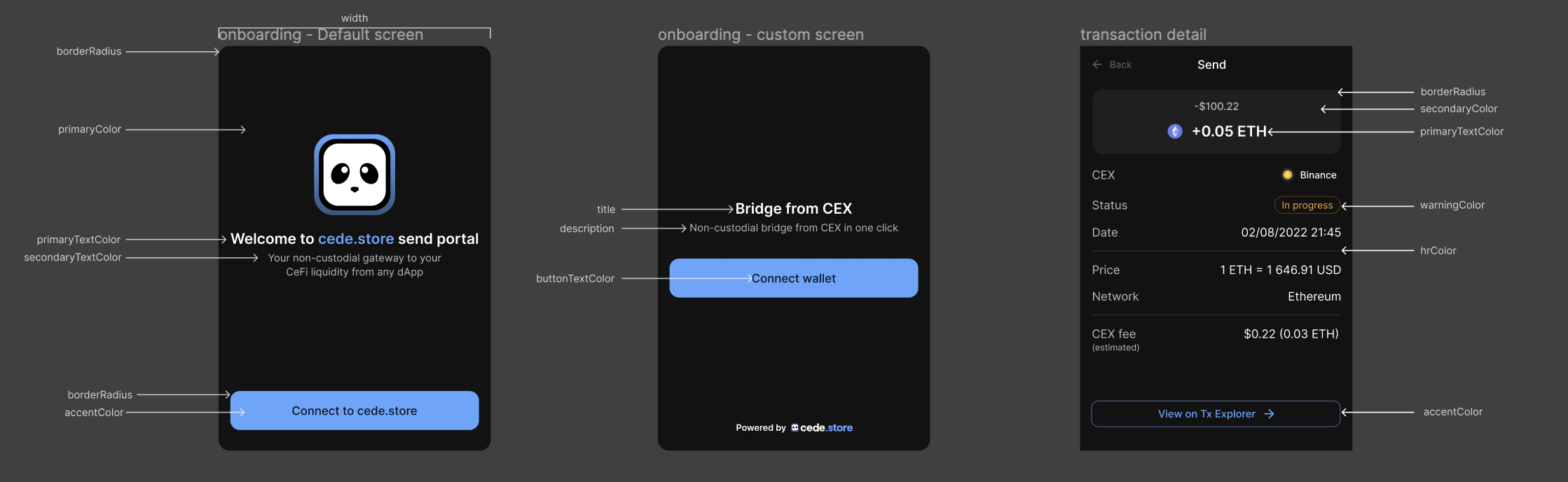
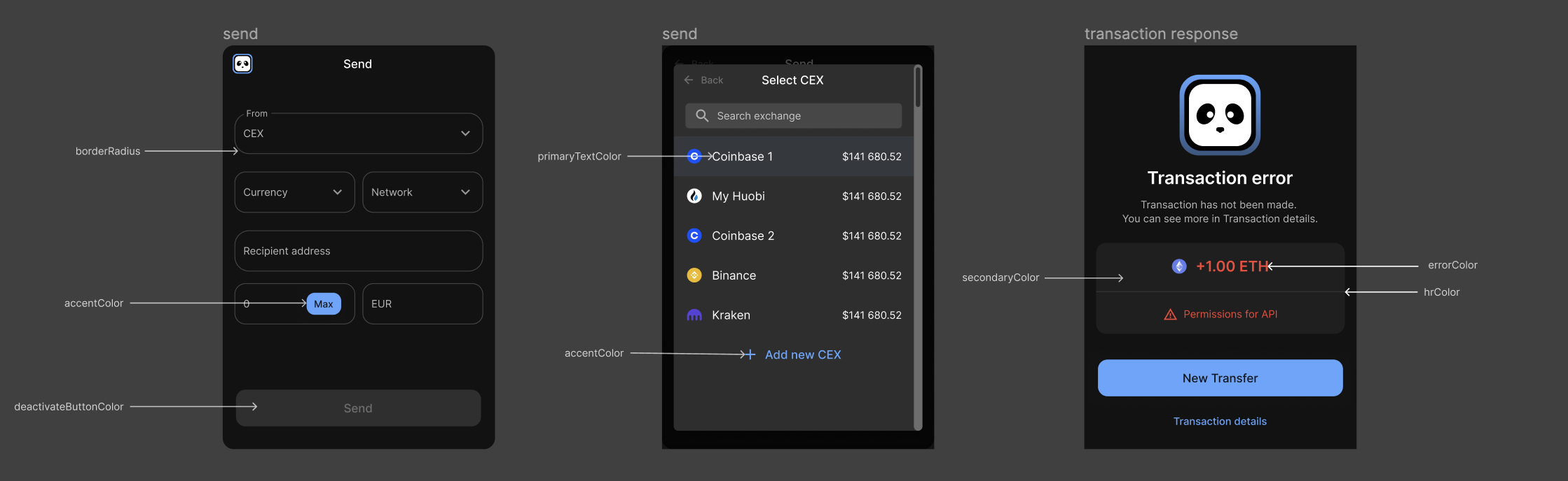
You can customize the widget by passing the same theme object defined here.
const widgetTheme: SendWidgetTheme = {
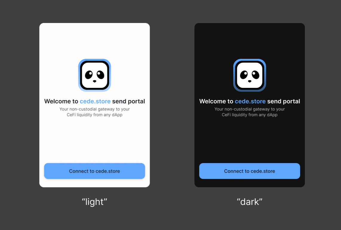
mode: "dark", // or "light"
logoTheme: "dark", // or "light"
fontFamily: "Inter, sans-serif",
borderRadius: 0, // 4 for 4px, most of our border radius are derived by multiplying or dividing this amount
width: "385px", // min 330px - max 500px
primaryColor: "#143b20",
primaryTextColor: "#000",
secondaryTextColor: "#000",
borderColor: "#fff",
inputBorderColor: "#fff",
logoBorderColor: "#143b20",
errorColor: "#000",
warningColor: "#000",
secondaryColor: "#fff",
accentColor: "#666",
buttonTextColor: "#fff",
deactivateButtonColor: "#000",
};
renderSendWidget(rootSelector, { theme: widgetTheme });Additional properties
The additional properties are the same defined here except for the logo and the navbarLogo:
export type SendUniversalWidgetConfig = {
  config?: SendWidgetConfig;
  theme?: SendWidgetTheme;
  title?: string; // inside the custom screen only
  description?: string; // inside the custom screen only
  logo?: string | null; // null to hide it, JSX if you need to replace it
  navbarLogo?: string | null; // null to hide it, JSX if you need to replace it
  logo?: string; // URL of the logo
  navbarLogo?: string; // URL of the logo
};

renderSendWidget(rootSelector, {
  title: "Lorem ipsum sit dolor amet",
  description: "Lorem ipsum sit dolor amet",
  logo: "/mylogo.svg",
  navbarLogo: "/mylogo.svg",
});
Mockups
Feel free to use this mockup to help you to configure your theme (Figma (opens in a new tab)).
Or you can directly test these properties using our configurator (opens in a new tab).
Also, you can change the mode in the widget theme.
Good Practice
To ensure a seamless user experience, it's imperative to implement the widget within a dedicated page. By doing so, you provide users with a focused environment where they can interact with the widget without distractions. This approach enhances clarity, simplifies navigation, and optimizes the overall user journey, ultimately leading to higher engagement and satisfaction.